this is quite the weird thing: a monument to a monument.
so no longer are the deaths of Rosa Luxemburg and Karl Liebknecht themselves the only thing worth remembering, instead the fact that a monument by the world-renowned architect Ludwig Mies van der Rohe once stood on this spot is seen as as important.
Wednesday, December 21, 2011
Friday, December 09, 2011
the road to ruin (pt. 4)
 some news in the long ongoing saga of Gillespie, Kidd and Coia's St. Peter's Seminary: http://www.bdonline.co.uk/news/masterplan-outlines-20-year-vision-for-cardross-seminary/5029083.article
Wednesday, November 16, 2011
london, london
 just a quick note on some recent reading:
as I've noted before I like Rowan Moore's writing in the Observer a lot and last weekend he wrote yet another very good piece, this time on the differences between public and private space, especially in relation to the City of London.
and while on that subject - the City of London, that is - here is Bob Stanley, of Saint Etienne fame, on the proposed system of elevated walkways meant to reach most parts of the Square Mile. of the parts that were built there's not very much that is still in use bar the walkways through the fantastic concrete maze that is the Barbican.
Sunday, October 30, 2011
from a balance beam (pt. 2)
 writing about churches, structure, decoration and crosses brought to mind this photo of a church in my hometown Jönköping.
from a balance beam
 seemingly unable to finish anything bar voluminous Victorian novels it's been more than a month since my last entry. I really wish it was because of lack of ideas, but fear it is more to do with laziness as I've started writing several posts in the meantime but just haven't managed to finish any of them. anyway here's a minor reflection on Swedish vernacular and Sigurd Lewerentz:
two weekends ago I happened to stumble on this advanced pillar-beam construction while walking around some farm buildings near my grandmother's.
I'm quite surprised I haven't seen the T before, I mean I've been running around near that barn since I was a little boy, but never have I noticed that pillar.
 it's nine years since I first visited Lewerentz's St. Peter's church in Klippan and during that time I've read about that extraordinary T-shaped pillar a couple of times. in his Modern Architecture Through Case Studies Peter Blundell-Jones writes about the T as a cross, and it probably is – it is positioned in the middle of a church, after all – but it seems it is also a traditional way of supporting loads from two beams when there might be practical reasons to use just one pillar.
Friday, September 09, 2011
lost and found
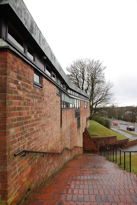 so there we were, at 9.30 in the morning, walking through the drizzling rain in a Scottish new town. it was Easter Sunday and we reckoned our best shot at getting into the church would be to try to get in right before mass. this was what we had come here for, the reason we were in this particular part of Europe.
when arriving at the church we slowly pushed the door open and found ourselves in the middle of an ongoing mass; seemingly we had made some error estimating the times. my catholic travel companion urged me to step in, and not really knowing what else to do I followed suit.
bar my grandparents' funerals this was the first time I found myself in a church during service for ten, maybe fifteen, years. being from a not particularly religious background in one of the most secular countries in the world the only reason I've been to church recently has been architectural. but there I was, doing my best to keep up with what was going on, suddenly being told to stand up to shake hands with the people that had been sitting around us. I never knew or had heard about that.
the fact is I've never been to churches as much as I have since starting to study architecture but, as I said, during that time this was only ever the third time I've seen one being used for what it was designed for, and – as the other two times were for my grandfathers' funerals – the first time I was in a state to actually take in what was happening.
after mass ended we were let to roam around the place, taking photos, exploring nooks and hidden corners. then we left by foot heading back towards the train station. on our way there we happened on some old cottages in grey stone (granite, I'd say, but my memory might be playing tricks on me). the cottages were lining a picturesque cobbled street, the whole scene utterly idyllic. this was nothing I had expected - we were in the town that gave birth to the Reid brothers and thus the Jesus and Mary Chain, after all - but it was beautiful indeed. even more so for its contrast with the surroundings.
 the more I travel to visit buildings, the more I appreciate unexpected happenings and scenes like these. the moments where you get to see something else, something unexpected. I used to work for a big firm and the study trips the office went on were painstakingly prepared: itineraries prepared by academics, local guides hired, restaurants pre-booked: it was the definition of a professionally organised trip. of course we got to see great buildings - and I assume I picked up a thing or two from those trips - but they were problematic to me in the same way that riding the underground in a strange town is problematic: you never get a sense of coherence, of how things are connected. you visit this one building to then immediately be on your way to the next. and this without really encountering neither the surrounding city nor the community.
not to overstate how much we've managed to take part of the local community when I've been on private trips with friends but at least we've had to rely on the people we encounter to get food, or to find our way. and in places where we've known the language we've suddenly ended up talking to some of the locals (ok, a couple of sentences exchanged with some children up an apple tree in Paspels is hardly a great exchange of views, but at least I know they find the Olgiati extension 'langweilig'). just the fact of being reliant on public transport is a great way of getting to know a city better. you're not just zoomed from one place to the other in your own private bubble but actually encounter people, and other parts of the city, on your way getting to your goal.
 a time before moving here I was visiting Malmö and decided to take a trip to Lund to have a closer look at some of Klas Anshelm's work and Bengt Edman's* brutalist student-housing Sparta. walking out of the station towards the Technical university I happened to lose my way. just as I found someone to ask for directions I realised I was standing across the street from Bernt Nyberg's archival building for Landsarkivet, a huge lump of Helsingborg bricks owing quite a lot to Lewerentz's late churches. this is a building I've seen at lectures but had somehow managed to forget about since. and there it was, just in front of me. lucky me! especially as I later found out it's about to be turned into student accomodation, with huge new windows punched through those expanses of brooding brick.
I know I'm always a tourist on any of these trips, just dipping a toe in and never actually taking part in the life around me, but I think that the chance encounters and unplanned distractions have been as important to me as what I've actually planned to go somewhere for, maybe even more so.
* Bengt Edman is, together with Lennart Holm, the architect behind Villa Göth, a building that – according to Swedish architectural lore – is the one that had Hans Asplund (Gunnar's son) characterising it as 'brutalistisk' (or some such phrase, the exact wording is never entirely clear) which is supposedly the starting point for the expression 'the New Brutalism'.
Thursday, June 23, 2011
taste the floor
I just found out Bobby Gillespie attended King's Park Secondary school, designed by Gillespie, Kidd and Coia. as one of GKC's finest buildings - the church of St. Bride's - is in East Kilbride where the Reid brothers grew up it seems there's a strong connection between GKC and the Jesus and Mary Chain at the time around Psychocandy.
if this is a good or a bad thing, and what it might have meant for the music I'm not entirely sure.
if this is a good or a bad thing, and what it might have meant for the music I'm not entirely sure.
Saturday, June 11, 2011
it's the same old song
 last weekend I made another visit to the Malmö Konsthall (1971-75) by Klas Anshelm and was reminded of Adam Caruso's essay on the building. what I noticed more than during any previous visit was the relation of the different parts to the surroundings: the way the outside defines different zones in the interior. I guess it was the fact that the large rooflight wasn't covered this time as it has been on several of my earlier visits.
even if the interior has this rough semi-warehouse feel it is worth noting that the building was much more radical and anti-institutional when new. it was conceived as one volume where the café was placed right next to the art with no separating walls, the only permanent interior walls were the ones surrounding the lecture theatre. it was basically the same idea as for Peter Celsing's Kulturhuset in Stockholm, or Centre Pompidou/Beauborg in Paris (where the man responsible for the programme for Kulturhuset, Pontus Hultén, was the first director): big open and flexible spaces meant to be adapted for every new exhibition.

 I'm not saying this is entirely wrong – I can imagine the presence of a café and chattering people creating problems when displaying certain kinds of art – but it is important to notice the difference, to notice how our attitudes have changed. nowadays we seem to think a work of art needs this kind of space to assert itself as art. just in the same way as religion might need a certain kind of space and somewhat arcane rituals and language to keep its air of holiness. if the goal of the avant-garde in the early parts of the 20th century was to break down the barriers between art and life throughout the last couple of decades we have instead tried to architecturally reinstate those boundaries, in this respect a lot has changed since the seventies.
Thursday, May 26, 2011
neu!
I have previously written about De Carlo's Magistero - a building I've been fascinated with for years now - and how it's a reworking of a medieval structure into a functioning modern building. it feels like it's time to revisit that topic, though from a different angle.
 let's start with Gottfried Böhm: last summer he seemed to be everywhere. to be honest 'everywhere' mostly consisted of someone at work mentioning him once and me reading about his Bensberg Town Hall (1962-67) in Peter Blundell-Jones and Eamonn Canniffe's Modern Architecture Through Case Studies 1945-1990 (a book I bought mostly because it featured said Magistero). the Town Hall is a concrete building set within the remains of a medieval castle and was so intriguing that the next time I found myself in a well-stocked bookshop I ended up buying a monograph on Böhm.
 through the monograph I found out not only that Böhm had done other projects in a similar vein – the first seems to be a hotel and restaurant in Bad Godesberg outside Bonn (1959-68) – but also that he designed a chapel on the site of Peter Zumthor's Kolumba Museum (1997-2007), a chapel now incorporated into the new museum. so let's take a look at these buildings and their attitudes to adaptations of older buildings*:
in Bad Godesberg** Böhm unceremoniously places his modern additions on and in-between existing wall fragments. while the original walls are of stone Böhm's additions are in fair-faced concrete, neither entirely breaking with nor blending in with the old ruins. in this way Böhm creates not a brand new building but an amalgamation: the new spaces are partly created by what built matter was already on the site. at the same time Böhm adhered to the often used modernist strategy of clearly separating the existing building and any new interventions: what is modern is undoubtedly modern: there is no mimicking of traditional forms or detailing.
Böhm used the same approach in his competition-winning entry for the Bensberg Town Hall***, although in a more extreme version. the old castle in Bensberg had been a ruin since the Thirty Years' War but in the mid-eighteenth century the ruin was converted into a monastery and later on also into a hospital. Böhm decided to get rid of these fairly recent structures and to only keep the medieval remains. in this way he had a podium of lower walls as well as one higher fragment curving around and protecting part of the site. the higher part of the wall ended in a high tower with a slate roof which he also retained. Böhm placed the council chamber against the higher wall fragment while placing all other accommodation in a C-shaped pattern around a courtyard open to the town. in this way the position of the council chamber, the complex's most important room, was shown to the surrounding town by the tower and from the building's courtyard by extensive glazing, two stories high.
 once again the interventions are modern, to say the least. the fenestration is in the form of ribbon windows thus clearly breaking with the romanesque windows of the original building (some of which were re-created from archaeological findings). in the more important parts - the stair tower and on the ground floor - the glazing is frameless which must be considered very advanced for the mid 60s.
just as in Bad Godesberg the junctions between new and old parts are not expressed in any particular way, rather new and old are juxtaposed with concrete simply sitting atop older stone walls.
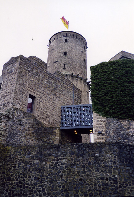
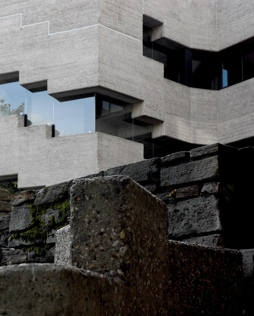
after the allied bombing of Cologne during the Second World War most parts of the church of St. Kolumba had been demolished but left standing was a medieval statue of the Virgin Mary. in 1948 Böhm built a chapel to protect the statue and in 1956 he added a sacristy along with a boundary wall to the monastery just north of the chapel.
 in 1997 there was a competition for a new diocesan arts museum on the site of the old church where Böhm participated. Böhm didn't win, instead the victory went to Peter Zumthor. in a move very reminiscent of Böhm Zumthor's proposal places new walls directly on to the structures already present on the site, be they medieval masonry or Böhm's post-war concrete walls. these new walls are made of a brick Zumthor developed especially for the project: a thin long slab hinting at both old Roman brickwork and at the masonry employed in his Therme Vals. in a way these brick walls become a mediation between the different periods already represented on the site: the detailing of the brickwork is very abstract hinting at modernity but in no way does it seem more modern than Böhm's 1956 concrete walls, rather the opposite. in this I think Zumthor has managed to strike a perfect note, the additions are clearly marked out as such but also function as a backdrop highlighting both the ruinous fragments and Böhm's structures as parts of special interest.
though Böhm himself have expressed reservations against Zumthor's project it seems the major difference between Kolumba and the Böhm projects I've discussed above is the fact that Böhm was still alive when Zumthor's project was built. apart from that it uses pretty much the same strategies regarding retention and interventions on sites already rich with history. I guess if there's one major difference it is that where Böhm at Bad Godesberg and Bensberg create a true collage from two equally important parts – what's existing and what's new – Zumthor's new structure is so much larger and more important than the older parts it feels as if it's about to devour them. if this is down to a different attitude or just a reflection of the size of the programme he had to fit on to the site I'm not sure.
* I probably should mention I haven't visited any of the buildings but rather have to rely on drawings, photos and other people's accounts.
** some more photos of Bad Godesberg can be found here
***and some very good ones of Bensberg can be found here
acknowledgements: both of the beautiful photos of Bensberg are stolen from SEIER+SEIER, photo of Bad Godesberg by TRiver
photo of Kolumba by Claus Moser
let's start with Gottfried Böhm: last summer he seemed to be everywhere. to be honest 'everywhere' mostly consisted of someone at work mentioning him once and me reading about his Bensberg Town Hall (1962-67) in Peter Blundell-Jones and Eamonn Canniffe's Modern Architecture Through Case Studies 1945-1990 (a book I bought mostly because it featured said Magistero). the Town Hall is a concrete building set within the remains of a medieval castle and was so intriguing that the next time I found myself in a well-stocked bookshop I ended up buying a monograph on Böhm.through the monograph I found out not only that Böhm had done other projects in a similar vein – the first seems to be a hotel and restaurant in Bad Godesberg outside Bonn (1959-68) – but also that he designed a chapel on the site of Peter Zumthor's Kolumba Museum (1997-2007), a chapel now incorporated into the new museum. so let's take a look at these buildings and their attitudes to adaptations of older buildings*:in Bad Godesberg** Böhm unceremoniously places his modern additions on and in-between existing wall fragments. while the original walls are of stone Böhm's additions are in fair-faced concrete, neither entirely breaking with nor blending in with the old ruins. in this way Böhm creates not a brand new building but an amalgamation: the new spaces are partly created by what built matter was already on the site. at the same time Böhm adhered to the often used modernist strategy of clearly separating the existing building and any new interventions: what is modern is undoubtedly modern: there is no mimicking of traditional forms or detailing.
Böhm used the same approach in his competition-winning entry for the Bensberg Town Hall***, although in a more extreme version. the old castle in Bensberg had been a ruin since the Thirty Years' War but in the mid-eighteenth century the ruin was converted into a monastery and later on also into a hospital. Böhm decided to get rid of these fairly recent structures and to only keep the medieval remains. in this way he had a podium of lower walls as well as one higher fragment curving around and protecting part of the site. the higher part of the wall ended in a high tower with a slate roof which he also retained. Böhm placed the council chamber against the higher wall fragment while placing all other accommodation in a C-shaped pattern around a courtyard open to the town. in this way the position of the council chamber, the complex's most important room, was shown to the surrounding town by the tower and from the building's courtyard by extensive glazing, two stories high.
once again the interventions are modern, to say the least. the fenestration is in the form of ribbon windows thus clearly breaking with the romanesque windows of the original building (some of which were re-created from archaeological findings). in the more important parts - the stair tower and on the ground floor - the glazing is frameless which must be considered very advanced for the mid 60s.just as in Bad Godesberg the junctions between new and old parts are not expressed in any particular way, rather new and old are juxtaposed with concrete simply sitting atop older stone walls.
after the allied bombing of Cologne during the Second World War most parts of the church of St. Kolumba had been demolished but left standing was a medieval statue of the Virgin Mary. in 1948 Böhm built a chapel to protect the statue and in 1956 he added a sacristy along with a boundary wall to the monastery just north of the chapel.
in 1997 there was a competition for a new diocesan arts museum on the site of the old church where Böhm participated. Böhm didn't win, instead the victory went to Peter Zumthor. in a move very reminiscent of Böhm Zumthor's proposal places new walls directly on to the structures already present on the site, be they medieval masonry or Böhm's post-war concrete walls. these new walls are made of a brick Zumthor developed especially for the project: a thin long slab hinting at both old Roman brickwork and at the masonry employed in his Therme Vals. in a way these brick walls become a mediation between the different periods already represented on the site: the detailing of the brickwork is very abstract hinting at modernity but in no way does it seem more modern than Böhm's 1956 concrete walls, rather the opposite. in this I think Zumthor has managed to strike a perfect note, the additions are clearly marked out as such but also function as a backdrop highlighting both the ruinous fragments and Böhm's structures as parts of special interest.though Böhm himself have expressed reservations against Zumthor's project it seems the major difference between Kolumba and the Böhm projects I've discussed above is the fact that Böhm was still alive when Zumthor's project was built. apart from that it uses pretty much the same strategies regarding retention and interventions on sites already rich with history. I guess if there's one major difference it is that where Böhm at Bad Godesberg and Bensberg create a true collage from two equally important parts – what's existing and what's new – Zumthor's new structure is so much larger and more important than the older parts it feels as if it's about to devour them. if this is down to a different attitude or just a reflection of the size of the programme he had to fit on to the site I'm not sure.
* I probably should mention I haven't visited any of the buildings but rather have to rely on drawings, photos and other people's accounts.
** some more photos of Bad Godesberg can be found here
***and some very good ones of Bensberg can be found here
acknowledgements: both of the beautiful photos of Bensberg are stolen from SEIER+SEIER, photo of Bad Godesberg by TRiver
photo of Kolumba by Claus Moser
Wednesday, May 11, 2011
the road to ruin (pt. 3)
here's the latest news regarding St. Peter's seminary from BD. I just hope something good will come out of all this.
I wonder a bit about what shape the restoration will take, and how they will handle the destroyed Kilmahew House that Gillespie, Kidd and Coia's scheme was designed around. will they just keep the ruined house or will they partially restore that as well? hopefully we'll see some plans in the next while and hopefully, hopefully, NVA will manage to find the money to go ahead with their plans as - although these magninficent ruins left half-forgotten in the forest do appeal to my romantic side - I'd be even more excited at the possibility of visiting a semi-restored seminary some time in the future.
I wonder a bit about what shape the restoration will take, and how they will handle the destroyed Kilmahew House that Gillespie, Kidd and Coia's scheme was designed around. will they just keep the ruined house or will they partially restore that as well? hopefully we'll see some plans in the next while and hopefully, hopefully, NVA will manage to find the money to go ahead with their plans as - although these magninficent ruins left half-forgotten in the forest do appeal to my romantic side - I'd be even more excited at the possibility of visiting a semi-restored seminary some time in the future.
Monday, May 09, 2011
this is radio etienne
 my last post had me thinking about the strange ways buildings seem to upset so many people. how can one ugly building annoy people so much they keep insisting it needs to be torn down? one of the ugliest cities I've ever been to is Tokyo – most of the buildings there are horrible, drab post-modern eighties stuff – but that has never detracted from my enjoyment of the beautiful buildings standing next to the ugly ones. more importantly it has never stopped me from having a great time in the city, they're just buildings after all.
to make an analogy; when I listen to the radio and a horrible song comes on I have three options: I either change channels, turn the radio off or suffer through the song in the hope that I'll like the next song better. to follow the analogy your options in a city where you find a building ugly is to leave the city entirely to live in isolation in a building to your choice in surroundings you do like, to decide to never pass that horrid building ever again or to be happy in the knowledge you'll like that other building over there much more than the one you happen to be passing at the moment.
as the first two options have seriously detrimental effects on your quality of life the only feasible option is to learn to live with the ugly buildings without letting them affect you too much. it really doesn't seem it will be too hard to do and as ugly buildings will always be around as long as we can't agree on taste – and I hope few nowadays persist in the folly there is a universally agreeable taste – a stoic indifference to them will be the best way to handle the buildings we just can't stand.
Wednesday, May 04, 2011
taste
 it's been a while. I can always try to blame moving cities and working too much, but it's probably mostly down to not having had any thoughts interesting enough to share.
but now I do.
my old college caught on fire earlier today. so far there haven't been any conclusive reports on just how bad the damage is. from photos in the papers it seems fairly clear that most of the lower parts towards Engelbrektskyrkan are severely damaged but it's hard to tell if it's worse than that.
I'd say huge parts of the residents in the surrounding areas are giving up a cheer tonight. after all the Architecture faculty at KTH is always voted in the top when it comes to the ugliest buildings in town. seems like the perfect time to revisit my ruminations on architecture and taste.
because I really can't understand all the abuse that's hurled at the building. yes, it's grey. yes, the ground floor is taken up by a car park. yes, the fenestration is repetitive. out of those three objections the only one I can find truly legitimate is the one concerning the parking. that parking is very unfortunate. it is also not the fault of the architect but of the city's planners and politicians. even more importantly it's something that can be mended.
we have to realise it's time to stop wasting our resources by tearing down perfectly sound buildings just because they're no longer fit for the purpose they were first meant for. we still look at individual buildings the way we look at our modernist suburbs (though – strangely enough – not the inner city): that they're works of art that should be protected in their entirety or torn down. but the way to handle any problems isn't to tear the building down instead we need to adapt what's already there to suit new needs. something must have happened since the destruction of Pruitt-Igoe*.
thankfully the idea of adapting and extending what's there seems to be spreading in Stockholm at the moment. the last couple of years have seen proposals for extensions/alterations from some of our most highly respected architects – Wingårdh at Thulehuset and Tham Videgård at Konserhuset most readily spring to mind – and the problem with them isn't that they're adapting an existing building but rather that they're adapting an existing landmark by making an extension that tries incredibly hard to assert its own presence, it tries so hard it pretty much overtakes the iconic building it's attached to. of course there are precedents for that, Markelius' roof-top extension to Centralpalatset is the obvious example in Stockholm, but that time it was an extension to a non-descript office building while Konserhuset is one of the most iconic buildings in Stockholm and Thulehuset's facade is one of the most recognisable and imposing buildings we have from its time. one of the profession's preferred ways to extend a building is to make an addition that is 'of its time' – to honestly separate new and old visually – and that is all well and fine, if a little boring at times, but when you try to outdo the host that's just plain rude. and rudeness, I'm afraid, isn't really that interesting.
so even though we need to adapt rather than to raze and build anew I just wish it would be done with a little more care. not because the city's authorities asks that of us (even if they might) but because the buildings themselves deserve it.
update 25/5: the low parts of KTH-A are indeed severly damaged but the higher parts escaped almost unscathed. some photos can be found in the latest issue of Arkitekten (pages 8–19).
* an event clearly demonstrating that Modernism as ideology was alive and well, rather than the opposite, whatever Charles Jencks says.
Thursday, March 31, 2011
london belongs to me
 as I touched upon it in the last part of my previous post I feel it might be time for a digression on memory, dreams and the city.
the first time I went to London I was almost 25. that means that for at least 20 years I had watched tv programmes and films set in London, and for more than ten years I had listened to music set in London, and read books and articles about bands in London. I was basically steeped in references to a city I had never visited. so finally coming there, for a rushed two-day trip where we were meant to stock up on clothes (at the time my travel companion and I were both living in Dublin and, as much as I love that city, it really wasn't the place to find clothes) and records was a weird experience.
everywhere we went I encountered names and places I'd read about but didn't really have any actual relation to: Neil's Yard, Wardour Street, Portobello Road, and, most puzzlingly, Ingestre Place. Ingestre Place was a mystery, suddenly we were standing in this tiny cul-de-sac surrounded by anonymous walls, and it had been me suggesting we'd go in there. because I had seen the street sign on passing and it stirred some kind of memory: I knew, I knew there was something that had been important to me that was related to Ingestre Place. but, to be honest, there was nothing there to even give a hint what that thing might have been.
way later, after having moved back to Sweden, I was rummaging through my LP's looking for some record or other when I cast a glance at In the Beginning There was Rhythm and there it was: Soul Jazz Records, 12 Ingestre Place, Soho, London W1F OJF England.
suddenly it made sense, suddenly it fit, something that was very important to me did have something to do with Ingestre Place. just not the actual street because to me Ingestre Place was never that cul-de-sac, never those office buildings. to me Ingestre Place was Soul Jazz Records, the company that had released some of my favourite compilations. and in the same way Parkway is Saint Etienne's London Belongs to Me, rather than the actual street. even when I last walked along it – in dreary January weather – I was transported to a lovely lunch in Regent's Park from years ago.
I have never really encountered this phenomenon on any other of my travels, not in Tokyo, not in Berlin nor in Milan. I guess it's because London is ubiquitous for those taking part of any kind of pop-culture. it's probably the same with New York, at least for those of a more American leaning even if not to me. it was strange, though, the feeling you knew this place but not having a clue why or why you'd even like to know this tiny little street in the middle of a bustling city.
Sunday, March 27, 2011
please allow me to introduce myself
I'm a man of impeccable taste; I've even got a diploma that says so. five years of my life I've spent in a government-sponsored correctional institution to make sure I have good taste. and I like things that are to my taste, or what I like to think of as my taste: neat, slender and ordered. so how come I like this:
 Parkway* in Camden?
this is not the kind of of bad taste architect's prefer to quote when trying to be edgy or showing off their oh-so-risky guilty pleasures (which I'm fully aware is kind of what I'm doing just now). Parkway is just too banal for that: there's nothing clever about it, and nothing particularly upsetting either. it's just a stretch of road lined with terraced houses of yellow London brick. the houses themselves aren't particularly coordinated with parapets changing level more or less with each building and on the ground floors there are shops. fronting the shops are hideous shop fronts in every kind of garish font imaginable.
 I was on my way to visit Long & Kentish's Jewish Museum and when arriving I was presented with a sombre door set in a rendered ground floor wall. and this is something I could have designed myself, this is what I really like. I even remember being impressed by the detailing of the door. so how come – when I later look at it in photographs – it looks so dull? I mean, I still am impressed, and feel this is what I like, but it looks objectively dull. in a lot of ways there's nothing particularly wrong with dullness, one might even say there are certain activities that need the dullness to preserve an air of dignity, but if this would be all there were to cities then they'd be terrible places to spend your life. a city needs the unplanned, the ugly, the left over.
what I'm getting at is this: at times when work are hard to come by voices are raised to protect the function of the architect. unfortunately I think the result would be utterly horrible. that is to say it would be charming, beautiful, well thought through and very tasteful - but also dead. because to a profession educating someone means to train them so they have the skills society expects of that profession. unfortunately, when it comes to architects, that also means to train their taste, to teach them to appreciate what an architect is supposed to appreciate. what an architect is supposed to appreciate is the well behaved modernism so beloved of the progressive upper middle classes at the beginning of the 20th century. I think (or deludes myself into thinking) that's what I've liked all my life – so I'm fine with that – but what about other people whose tastes aren't catered for in architecture schools, why shouldn't they be allowed to influence what our cities look like? and when they try to, by changing their shop front say, why should their wishes be mediated through consultants who have been trained to have good, government approved, taste?
*the first time I heard the name Parkway was in the St. Etienne song London Belongs to Me, and I must say that compared to the loveliness of that song the reality is pretty meagre, but as a city street I find it quite exciting.
Sunday, March 06, 2011
the road to ruin (pt. 2)
seems it's time for a lot of follow-up posts. here's some recent news from the AJ about St. Peter's Seminary. there's also a link to the brochure from the Scottish exhibition at the Venice biennale on the right hand side of the article.
I will try to come up with some original content soon.
I will try to come up with some original content soon.
Saturday, March 05, 2011
the glasgow school (pt. 2)
I'm finally back to leading a normal life, going to sleep at normal and socially acceptable hours. still all I can offer you is yet another link to a Rowan Moore* piece: http://www.guardian.co.uk/artanddesign/2011/feb/25/mackintosh-glasgow-school-art-extension
 I think the article does raise some important questions, especially as to if a new strong architectural statement just across the street from the GSA is what will benefit the existing building and context. the buildings on the site today are no masterpieces, but they're hardly horrible either (well, the GKC staff common room might actually be), they're just that kind of background buildings which make up most of our cities. and to me that seems just about right. of course you can argue that a new building for the school should have as prominent a place in the city as the existing one, but will anyone actually benefit from two buildings having some kind of architectural shoot-out across Renfrew Street? even if it's a fairly low key shoot-out? I dread to think what would have been the result had Zaha Hadid had her chance to build there.
I used to think that the only thing planners should influence when it comes to a new building is the maximum height and volume as materials, massing and expression should be left to each building's architect or their client. but this time the client is the owner of the most important building in the vicinity and for that reason maybe they should reconsider.
having said that, the school seems to have paid great attention when selecting architect: short-listing competent firms that aren't the ones they would have chosen were they only out to make a statement. maybe the problem is in the programme, maybe they're trying to cram too much onto too small a site? it would hardly be the first time that has happened. I was once involved in an extension for a Swedish college where the city had decided the foot-print, height and number of floors after a competition. still the client constantly asked us to try to cram more and more accommodation into the set volume leading to the loss of any decent intermediate spaces so that what was an atrium ended up as mean corridors receiving no natural light.
I'm not entirely sure why I'm so hesitant about Holl's proposal, it might just be the glass. I mean, I love the glass of the Diener & Diener college in Malmö, so it's not glass per se, but something about an all-glass building just seem alien to the site. a little too delicate and crisp. and it won't be glass as a membrane, as on the main elevation of the Mack, but rather glass as a sharp, angled object.
ok, maybe this post amounted to some more than merely posting a link, let's see how long I might be able to keep this up for...
update 21/3: the extension passed the planning committee
* he's become one of my favourite writers of architectural criticism. to paraphrase an old movie: he had me at "If bright colours always cheered you up, then entering the blue-and-yellow cabin of a Ryanair jet would be like swallowing a bottle of happy pills. It isn't." incidentally I read that piece just days after first visiting the Mack.
Monday, February 21, 2011
I'm so tired
the blog is currently on a competition hiatus, slightly longer than I had planned for but I'll soon be back, hopefully with some new insights. I'm afraid chances are they'll only concern things such as Finnish lakes and thoughts on how to place an elevator in a museum.
in the meantime here's yet another excellent article from the Observer, this time about Adolf Loos, and we can't really have too many of those now, can we? (I'm sorry I can't even find time to put in any additional links, but I've read quite a few good posts on Loos over at Fantastic Journal so I'd direct you that way for any further reading; oh and to Beatriz Colomina, of course)
in the meantime here's yet another excellent article from the Observer, this time about Adolf Loos, and we can't really have too many of those now, can we? (I'm sorry I can't even find time to put in any additional links, but I've read quite a few good posts on Loos over at Fantastic Journal so I'd direct you that way for any further reading; oh and to Beatriz Colomina, of course)
Monday, January 17, 2011
a house is not a home
here's a slideshow of the Melnikov House, courtesy of the Observer, and here are some ruminations on architecture and change featuring said house from Fantastic Journal.
Subscribe to:
Posts (Atom)